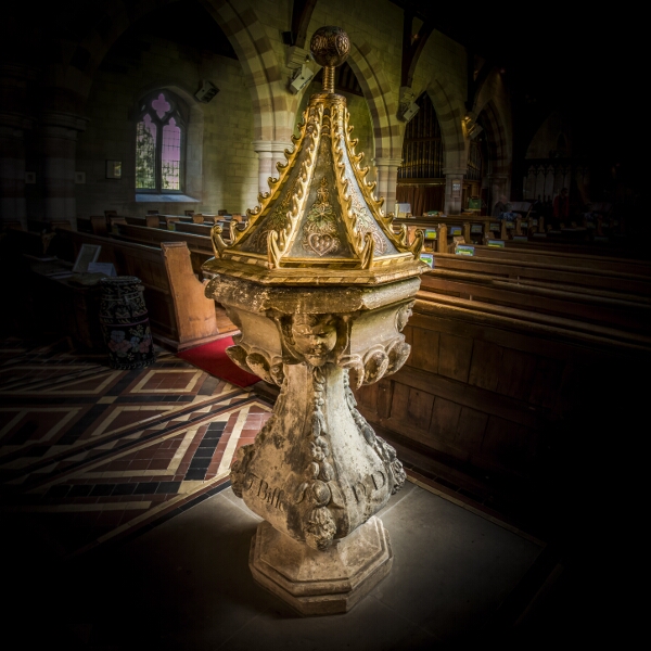
This is a particularly elaborate baluster font with a swelling central pillar, a style popular in the late seventeenth and eighteenth centuries and sometimes described as “bird-bath”. Unusual features are the cherubic faces around the bowl and the inscription, on three sides of the pillar, to Thomas Bisse D.D. (Doctor of Divinity) 1722; indicating it was probably commissioned and donated by him as Rector of Cradley. The cover is not original.
It would not have been the first font in the church. Over the inside of the small doorway in the south side of a tower are two half-octangle stones which are the remains of an older, possibly Norman font. This doorway, once thought to be Anglo-Norman, was added after 1717, possibly to give bell-ringers easy access to the ringing chamber, so Thomas’s Bisse’s font could have been a direct replacement.
Fashions do change, even in fonts, and for many years Cradley church had two! In the late 19th Century Bisse’s font was considered ugly, and after the Victorian restoration of the church, the then Rector, Rev. Edward Renn Hampden, commissioned a new, large font made of Cradley stone and modelled on the one in nearby Bosbury church. This was described in 1913 as of “clean appearance giving it a simple dignity of its own.” It stood near the south door and was removed in 1947.
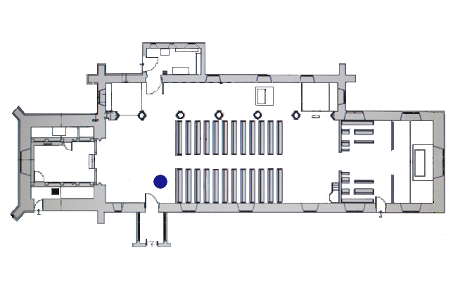
For many years, the Bisse font was at the back of the nave. When the Victorian font was removed, it was restored, placed on a square stone plinth and its ornate cover added. When the west end was re-arranged in 2010, it was removed from its plinth and placed near to the south door, a position entirely in keeping with the views of Thomas Bisse. In one of his Rolls Chapel sermons of 1716 entitled “The Beauty of Holiness in the Common Prayer” he wrote: “The Christian church is built after the pattern of the Jewish…as the entrance to the Jewish church was by circumcision, so the entrance into the Christian church is by baptism.”


